Meet The Crocodile: A Chair No One But A Graphic Designer Would Make
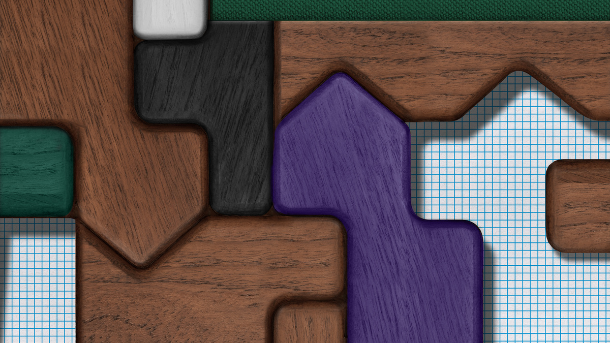
Image Courtesy: Studio Feixen
Parni Ray
26.03.2024
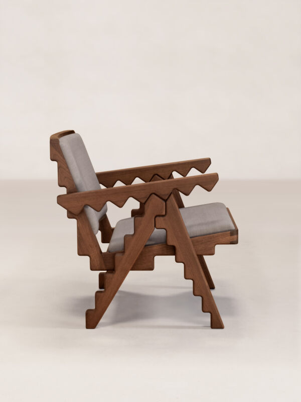
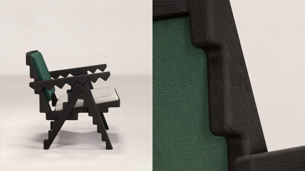
“It's rare for a graphic designer to get to make a chair,” Felix Pfäffli says with a satisfied chuckle. “So, having got a chance, I started with the ambitious goal of creating something that would stand out in the story of design”. The result, the ‘Crocodile Chair’, is a testament to Felix's foundation in the Swiss style of graphic design. By choosing the Chandigarh Armchair as his starting point, it is also an oblique nod to the International style of architecture that manifested in Le Corbusier's designs for Chandigarh.
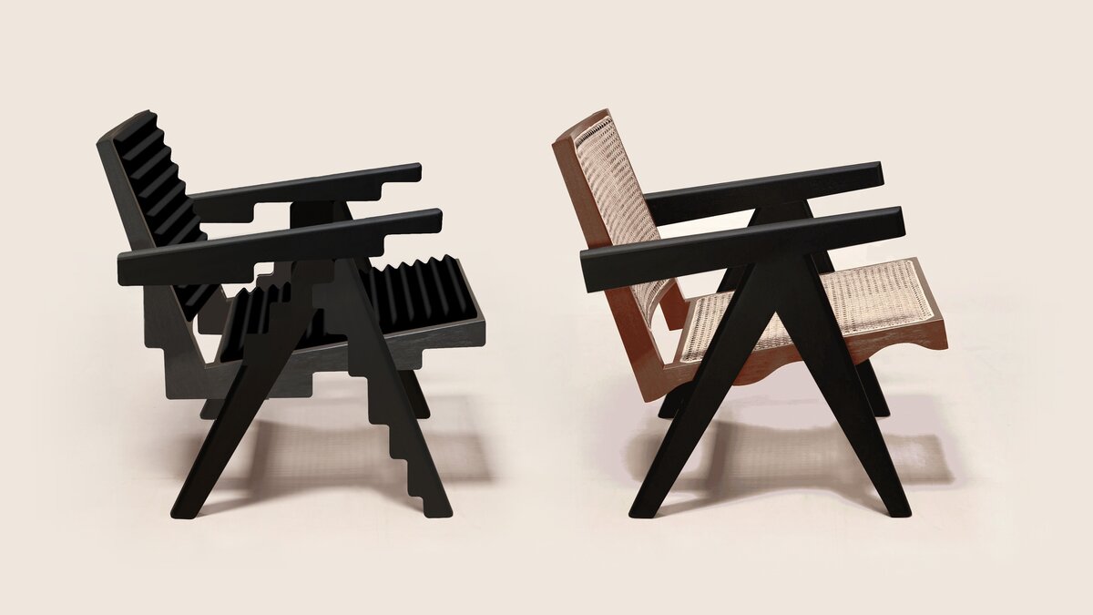
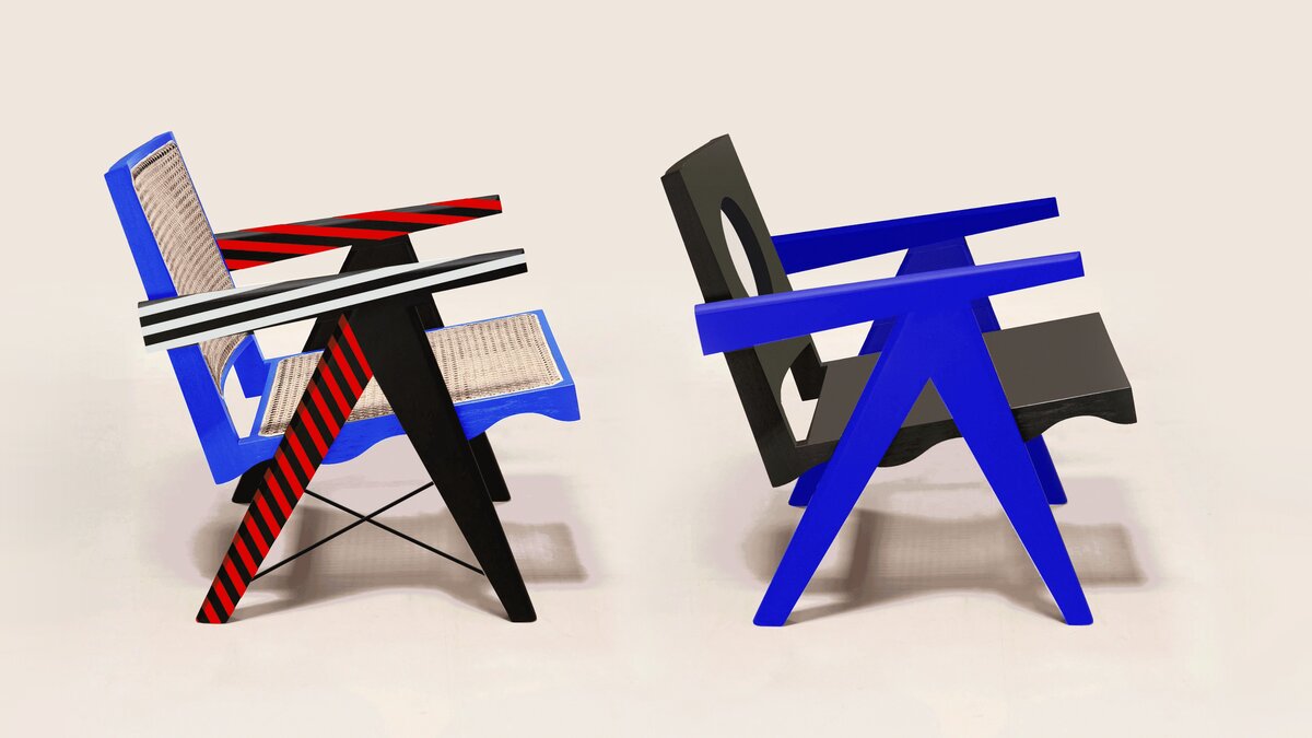
It all began with a series of sketches. Felix Pfäffli, the founder of Studio Feixen, started working on the design of the Crocodile Chair shortly after a chance chat with Aparna Rao, Phantom Hands’ co-founder. While his drawings played with the colour and shapes of the original chair, the armrest remained the centre of his focus from the start. Speaking about the initial concept of the chair, Felix says, “The first idea was to create a chair which totally works with the idea of straight angles. But, the longer I worked on the concept, the more I realised it was not about the straight angles but much more about the very unique armrest and the resulting joinery in the centre, which was part of my first sketch of the chair.”

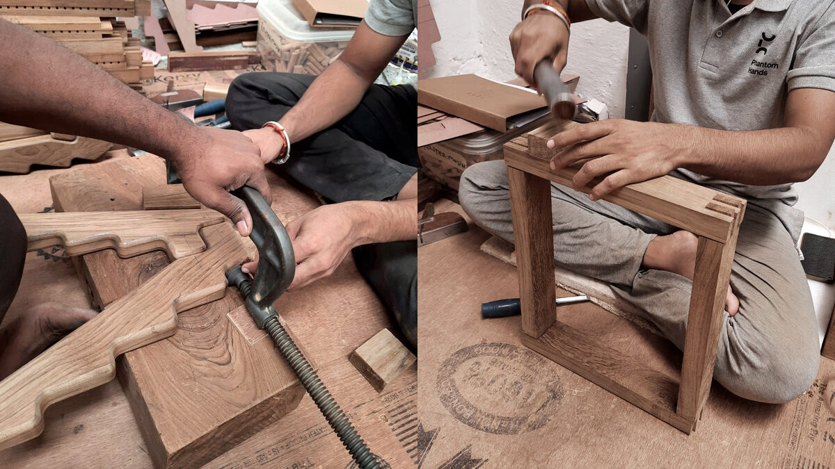
“The whole process was really fast. I sent over a bunch of drawings, and (the) Phantom Hands team came back with their own. Soon we had the 3D model and then, within a month, the first real prototype in wood”, Felix recalls. Seeing the chair in person surprised him, as he had hoped it would. “It looked very strange and like something you wouldn’t do or see normally. I liked that.”
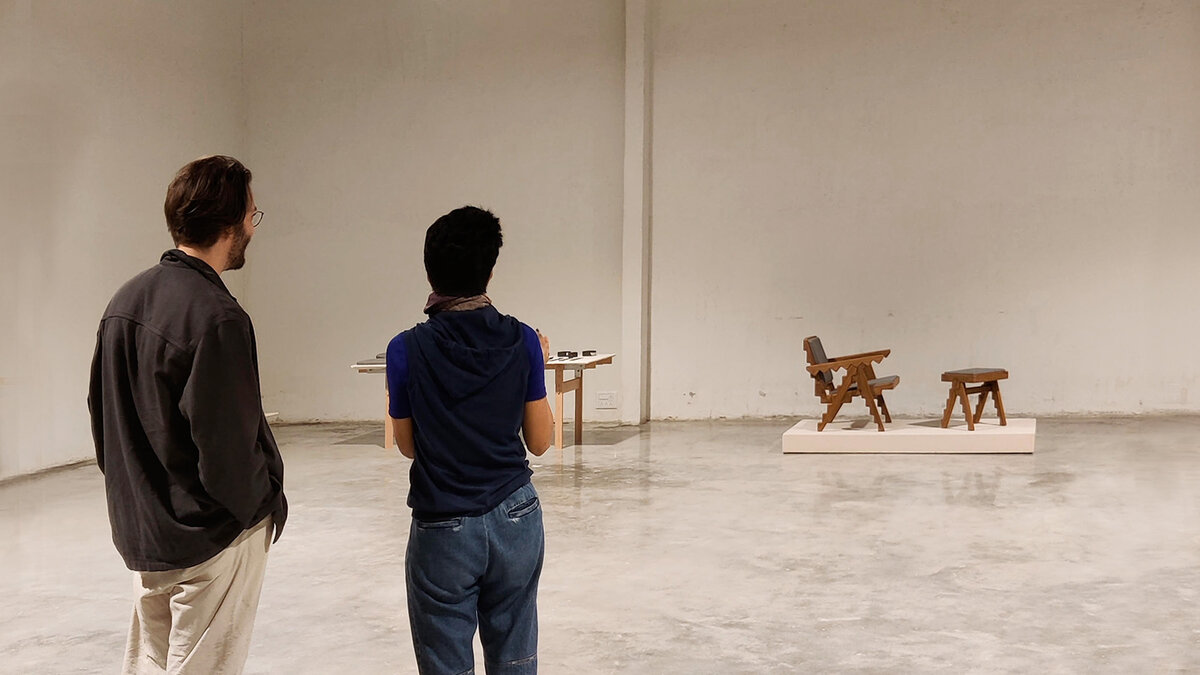
“It looked very strange and like something you wouldn’t do or see normally. I liked that.” - Felix Pfäffli
The Timeless Touch of Swiss Graphic Design
Felix’s introduction to the ‘story of design’ began at the Lucerne University of Applied Sciences and Arts. His learnings there still form the basis of his work. The illustration-oriented design training made drawing integral to his process. Exposure to both traditional and contemporary modes of making inculcated ease of switching between mediums. Like most graphic designers trained in Switzerland, Swiss graphic design became an inspiration. It still remains a toolbox he dips into regularly, “often without even thinking about it”.
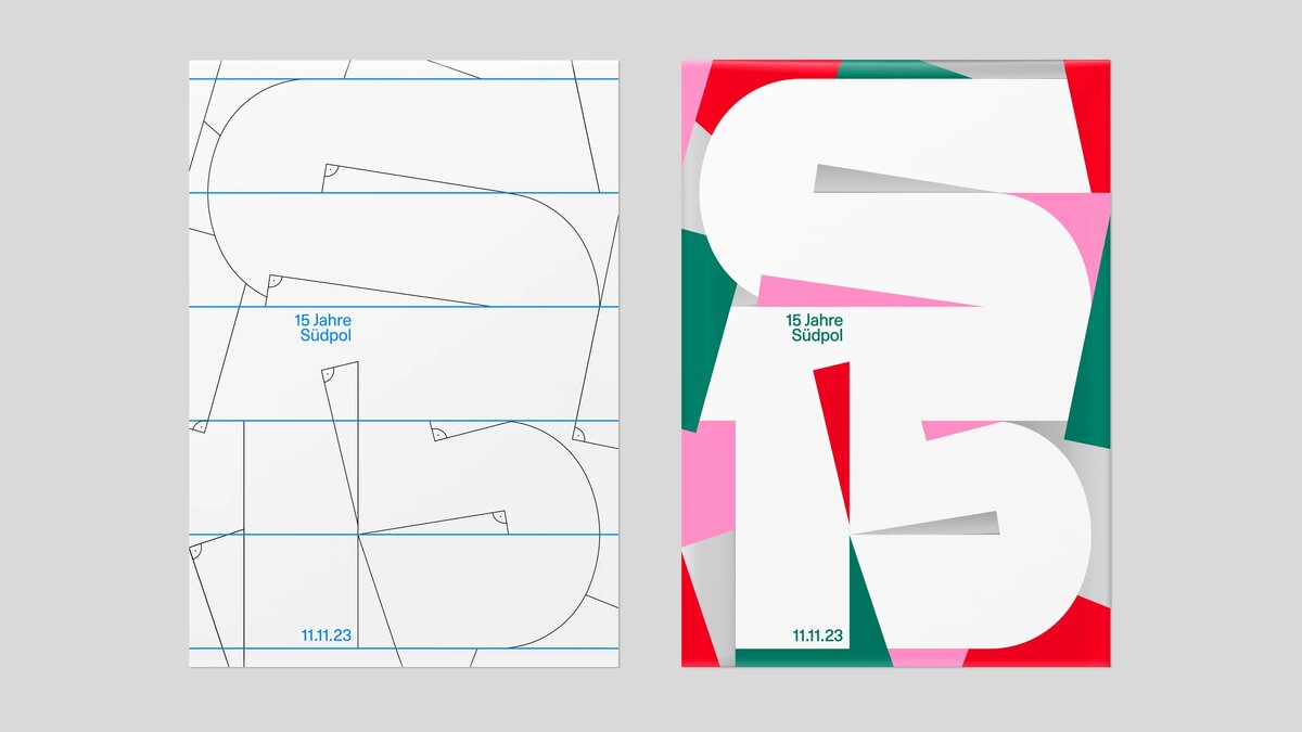
Swiss graphic design—or the ‘Swiss style’—surfaced in the 1950’s in Switzerland and Germany. It was influenced by the principles of Classical Modernism, Russian Constructivism, Dutch Neoplasticism, the Bauhaus style and the Ulm School of Design and focussed on simplicity. From the start it has been associated with posters, stamps, signage—contexts in which it still continues to be a default. Letting go of decorative embellishments and beautification, it centred the traits of clarity, function and communication. Minimalism, clean lines and grid formations became its characteristic features.
“What I like best about the Swiss style is its accessibility,” Felix says, “It travels easily across places and speaks to everyone, notwithstanding language limitations or cultural differences.”
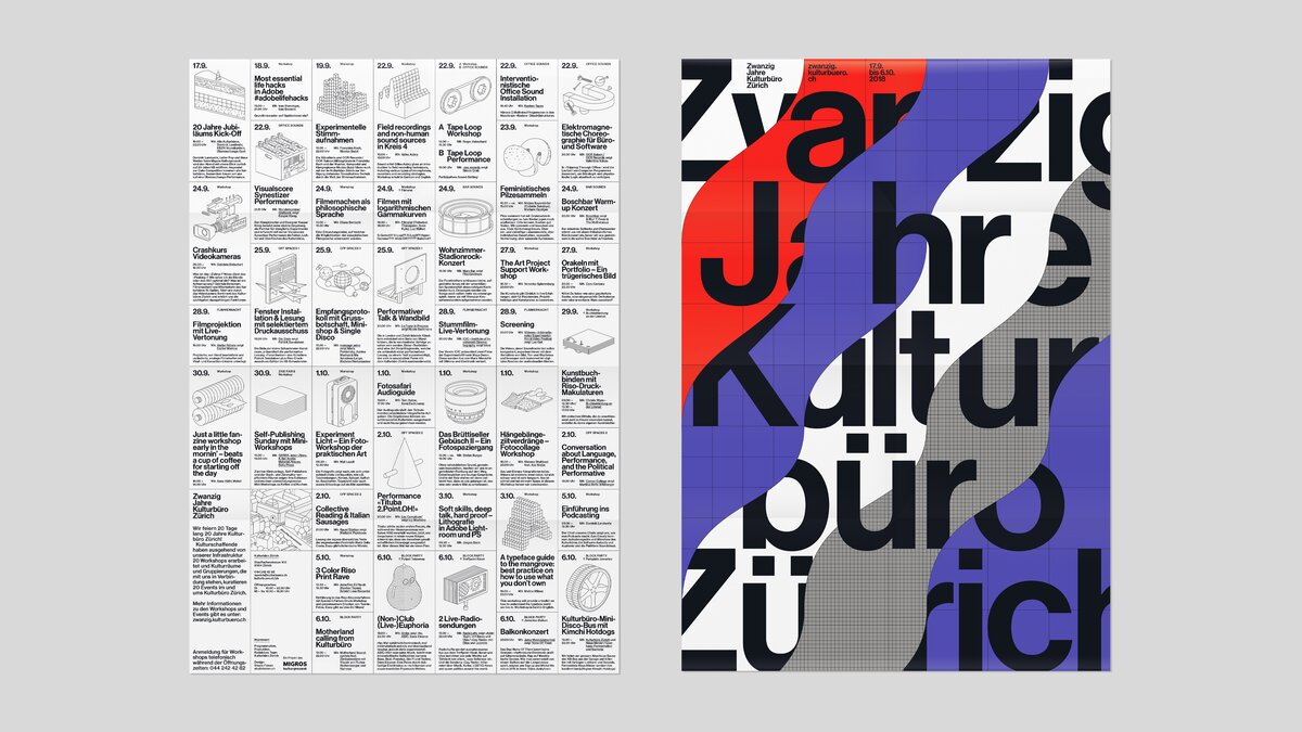
The Globality of the ‘International Style’
Mobility has been foundational to the Swiss style, known widely as the ‘International typographic style’ and used across the world. In this, its ideals echo that of the International style of architecture which was born during the post World War 1 architectural movement and produced the built structures we have come to describe as Modernist.
As in graphic design, the International style in architecture marked a departure from ornamentation, prioritising the purpose and usability of a built structure instead. The principles of building it were understood to be applicable across contexts and locations, and thus were universally true. Hence, the ‘International’ moniker.
Architects who ascribed to the International style created flexible, modular designs, typically based on the grid. Among them Le Corbusier, who famously designed the city plan of Chandigarh and its Capitol Complex—a prominent example of the International style—both based on the grid structure.

Questions have emerged about the universal ideals of the style over time. It has been asked if the principles governing the making of spaces people inhabit can really be the same across places, cultures, climates and times. While the answers to that might be contentious, Chandigarh’s furniture has proved that in some forms, design can indeed travel across place and time.

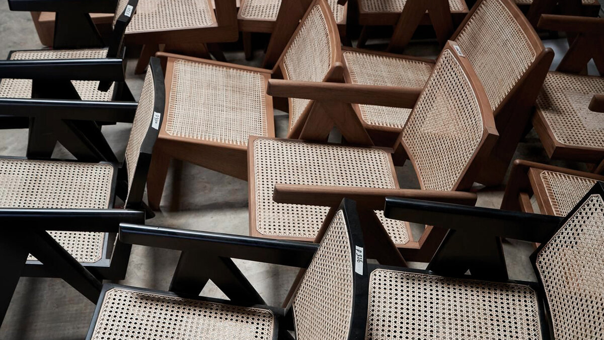
The Journey of Chandigarh’s Chairs
The Chandigarh armchair that inspired Felix's Crocodile chair, for instance, has its roots in mid-century European modernist design. Its final structure was however adapted to the modes of production and the skill of craftspeople available during the making of Chandigarh. For years the chairs thus produced were used in the city, in turn inspiring a variety of other local furniture. Decades later, the original chairs managed to gain an audience, and eventually a foothold in the international market. Since then, they have travelled widely, across borders, making their way into a variety of contemporary spaces in recent years.
Breakthrough Beyond the Grid
Like many, Felix knew of the chairs before starting on his collaboration with Phantom Hands. He wasn’t looking to change their initial design too much, just lend it a new perspective. So, at first, he played safe and left the straight angles of the chair untouched. But then the idea of the ‘teeth’ on the armrests hit him. “Whenever I tried to remove the jagged armrest, I felt like something got lost. So we kept the armrest. It went totally against all the rules I was trying to abide by,” he says. “But it was that unexpected element that lent the design a new character.”
This reminded Felix of a quote by the modernist graphic designer and self-styled ‘information architect’ Massimo Vignelli, who designed the NYC subway signage in the 1970's. “Don’t be governed by the grid, govern the grid. A grid is like a lion cage - if the trainer stays too long it (sic) gets eaten up. You have to know when to leave the cage - you have to know when to leave the grid.”
“We know the rule and know that it is important to break it at the right moment.” - Felix Pfäffli
Thinking back on it, Felix says, he realised he needed to step away from the rules he had been clinging to, rules he had been trained to follow. “In Switzerland, we are trained in grids, hierarchies of text sizes, typesetting and so on. This means that we are familiar with very traditional rules and techniques. We know the old machines, the typesetting boxes and know how to operate them. Our lecturers were trained by or worked with the inventors of this “International style” or ‘Swiss style’ in graphic design. We know the rule and know that it is important to break it at the right moment.” So, he decided to give the crocodile its own space. “Doing so, let me combine both,” he reminisces. “The elements of the chair that are completely within the grid and the eccentric armrest, which is its own thing. Finally everything merged together in harmony.”
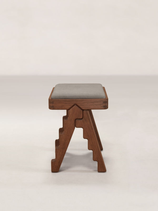
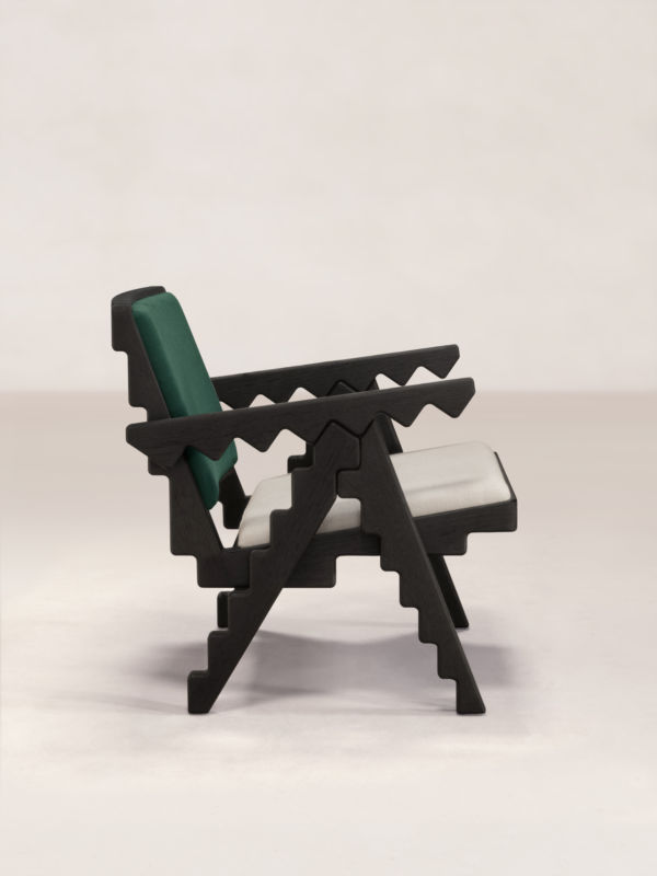
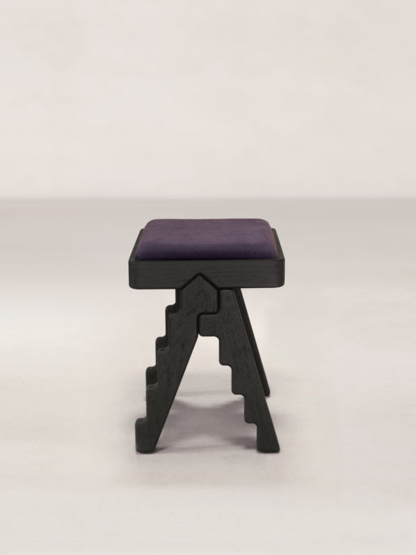
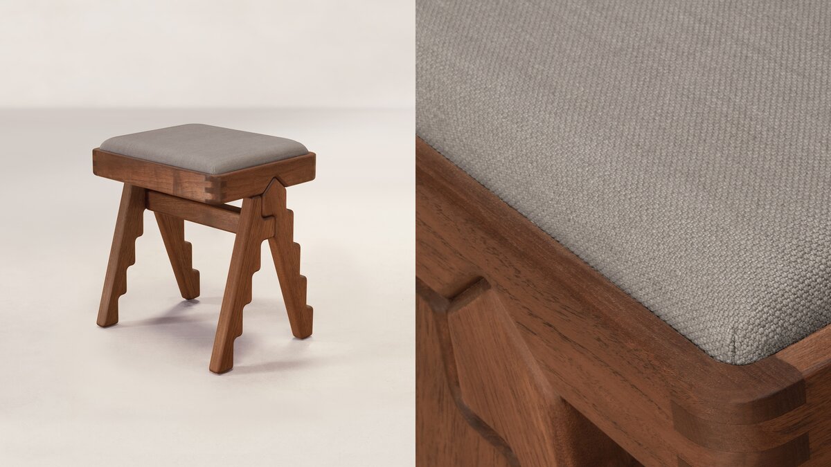
The Crocodile Chair and Stool are made of solid wood and come in a selection of two wood finishes and four fabric colour pairings for each of the wood finishes. The upholstery colours are custom-developed by our fabric collaborator Zanav, through the traditional process of vat dyeing handspun yarn. The can be purchased from Phantom Hands or our authorised resellers.
